Lesson
A Lesson is reading-and-watching content. No score, no submission. It is a stack of blocks, and blocks are where most of the editor’s surface area lives.
Adding a block
The bar at the bottom of the editor lists every block type.

Two behaviours, and the difference is the caret on the pill:
- With a caret — clicking expands a panel of variants, each with a preview thumbnail. Nothing is added until you pick one.
- Without a caret — clicking inserts the block straight away, because that type has only one variant.
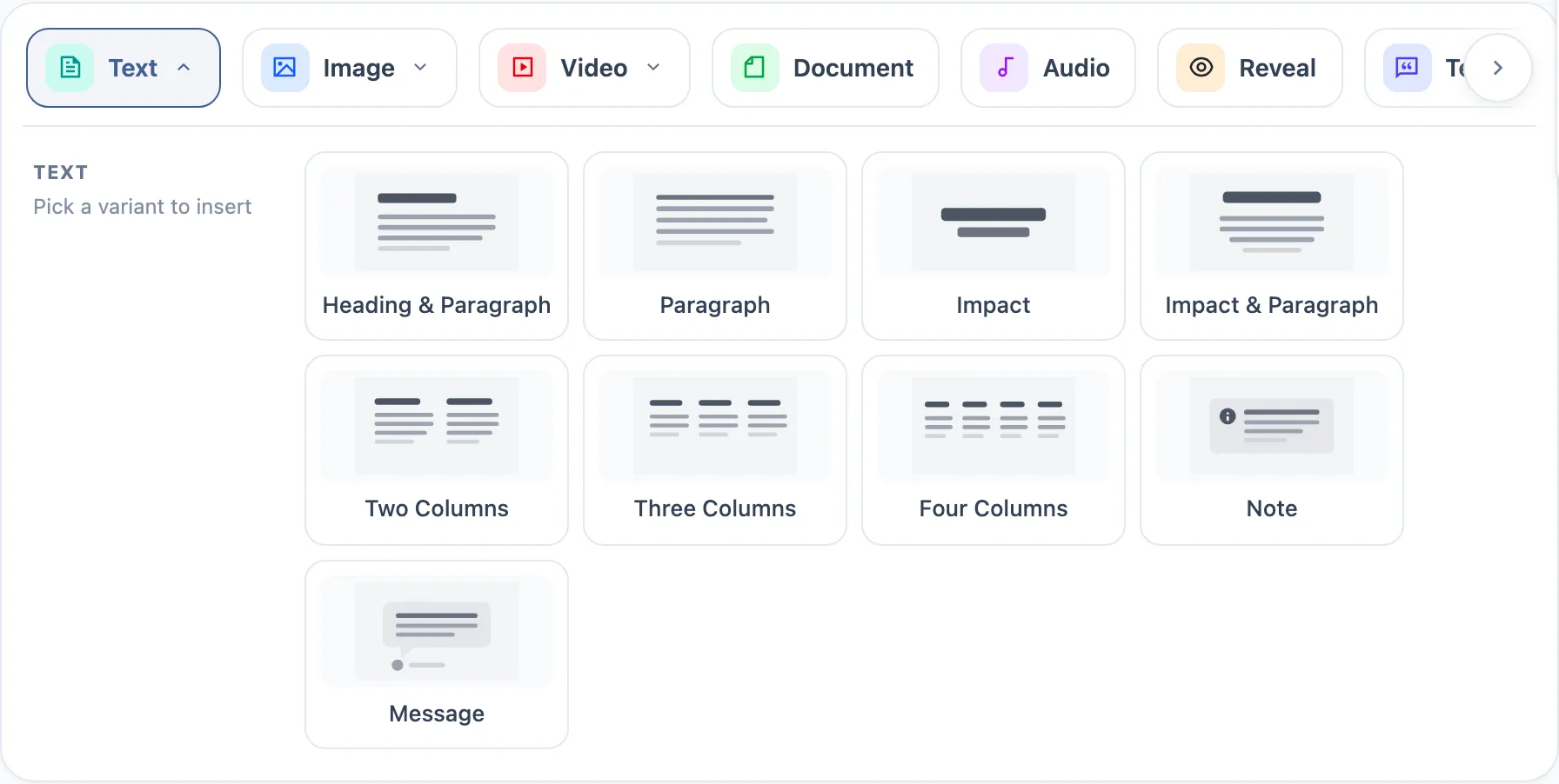
The bar scrolls horizontally — the arrow at the right end is not decoration, there are more types than fit.
Every block type and its variants
| Block | Variants |
|---|---|
| Text | Heading & Paragraph · Paragraph · Impact · Impact & Paragraph · Two Columns · Three Columns · Four Columns · Note · Message |
| Image | Centered Image · Full Width Image · Two Column Images · Three Column Images · Four Column Images · Image with Text · Text with Image · Image Gallery · Banner Carousel · Image Compare |
| Video | Centered Video · Full Width Video · Video with Text · Text with Video |
| Audio | Centered Audio |
| Document | Centered Document |
| List | Ordered List · Unordered List |
| Testimonials | Centered Testimonial · Testimonials Grid · Testimonials Carousel |
| Flashcard | Single Flashcard · Flashcard Grid |
| Sequence | Vertical Timeline · Alternating Timeline · Horizontal Timeline |
| Chart | Bar Chart · Horizontal Bar · Line Chart · Area Chart · Pie / Donut |
| Funnel | Funnel · Pyramid · Stepped Funnel |
| Reveal | Reveal — content hidden until the learner acts |
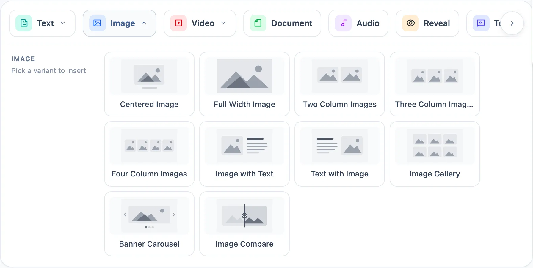
Layout-shaped variants — the column ones, Image with Text, Text with Image — are the ones most likely to break at narrow widths. Give them a pass at phone size.
A placed block
Every block carries a header naming its type and its current variant, plus the row actions:

| Control | What it does |
|---|---|
| Move up / Move down | reorders the block within the lesson |
| Duplicate | copies the block in place |
| Delete | removes it |
| The type and variant labels | open the pickers for changing either |
Styling
Two separate levels, and they are easy to confuse.
Style — the whole activity
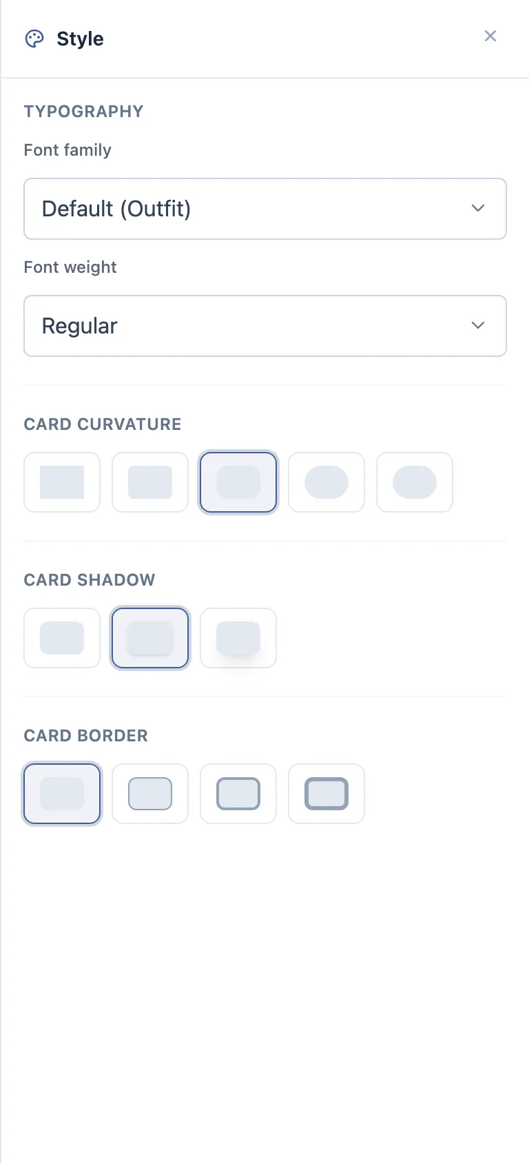
The Style settings button in the editor header opens a panel that restyles every block in the activity at once.
| Group | Options |
|---|---|
| Font family | Default, plus Inter, Roboto, Open Sans, Lato, Poppins, Merriweather, Playfair Display, Montserrat, Source Sans 3, Nunito, Raleway, PT Serif |
| Font weight | Light · Regular · Medium · Semi-Bold · Bold |
| Card curvature | None · Small · Medium · Large · Full |
| Card shadow | None · Small · Large |
| Card border | None · Thin · Medium · Thick |
Defaults are Regular weight, Medium curvature, Small shadow, no border.
Layout and Settings — one block
A block’s header can carry two round icon controls, right after the variant name:
| Control | Opens |
|---|---|
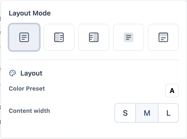
| Palette icon | Layout — how the block sits on the page |
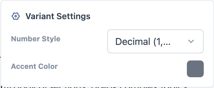
| Gear icon | Settings — options specific to that variant |
Neither is always there. The gear only appears for variants that actually have settings, and that is by design, not a missing button:
| Has Settings | Has no Settings |
|---|---|
| Text › Two / Three / Four Columns, Note, Message | Text › Heading & Paragraph, Paragraph, Impact, Impact & Paragraph |
| Image › column layouts, Image with Text, Text with Image, Gallery, Banner Carousel | Image › Centered, Full Width, Compare |
| Video › Video with Text, Text with Video | Video › Centered, Full Width · Audio · Document |
| List, Flashcard, Testimonials, Chart | every question type |
Layout covers the block’s frame: a Layout Mode (none, background, or media on top / left / right, filled with a colour, a gradient or an uploaded image), a colour preset, background and text colour, content width, and padding top and bottom — with a Reset for the colours.
Settings is whatever that variant needs — columns and gaps for a grid, marker style and accent colour for a list, author size and highlight colour for testimonials, legend, grid and stacking for a chart, items per view and navigation for a carousel.
What to check
- A change in the Style panel reaches every block, including ones added afterwards.
- Font family and weight actually change the rendered text, not just the control.
- Curvature, shadow and border are visible on the block cards.
- The gear is absent exactly on the variants listed above, and present on the rest.
- A per-block Layout or Settings change affects only that block — this is the check that catches the worst bug on this surface.
- Switching a block’s variant does not silently drop its settings.
- All of it survives a reload, and reaches the learner view — check both.
Reordering and batch actions
The Content Blocks sidebar lists every block with its position, variant and a thumbnail; drag a card to reorder, click one to jump to it, and tick two or more to move or delete them together. It works the same in a quiz and a survey, where it is called Questions — the full walkthrough is in what activities share.
Steps
- Add a Text › Heading & Paragraph block. Type a paragraph with an accent —
ação— and some bold text. - Switch that block’s variant to Two Columns, then to Note. Watch the content.
- Add an Image › Image Gallery, upload two images, and fill in alt text on each.
- Add a Video › Video with Text, a List › Ordered List with three items, and a Flashcard › Single Flashcard with both sides filled.
- Add a Chart › Bar Chart and give it a few data points.
- Add a Sequence › Vertical Timeline with three steps.
- Open settings and layout on one block and change something visible.
- Move a block up, duplicate one, delete another.
- Leave the editor without saving explicitly, come back, reopen.
What to check
- A pill with a caret never inserts anything until a variant is picked.
- Switching a variant keeps the content and only changes how it looks — this is the single most valuable check on this page.
- Accented text and formatting come back exactly as typed.
- Images survive a reload, and their alt text with them.
- The duplicated block is independent of its original.
- Block order after a reload is the order you left.
- Column and side-by-side variants stay readable at phone width.
The accessibility checker
If it is enabled for your tenant, the editor header has an Accessibility Checker. It
flags: image with no alt text, alt text that is just a filename, alt text that is too
long, an empty heading, a skipped heading level, an h1 inside content, an over-long
heading, and broken list structure. It also runs completeness checks — a media block with
no URL, an empty text block, a flashcard missing a side, a question with no options.
Worth a pass: create the problem on purpose, open the panel, confirm it is reported and that the quick fix resolves it.
Where it usually breaks
- Variant switching losing content instead of re-presenting it.
- A duplicated block sharing content with its original.
- A gallery or carousel showing only the first image.
- Media that renders in the editor but not in the learner view — check both.
- Leaving the editor immediately after a change, before the save lands.